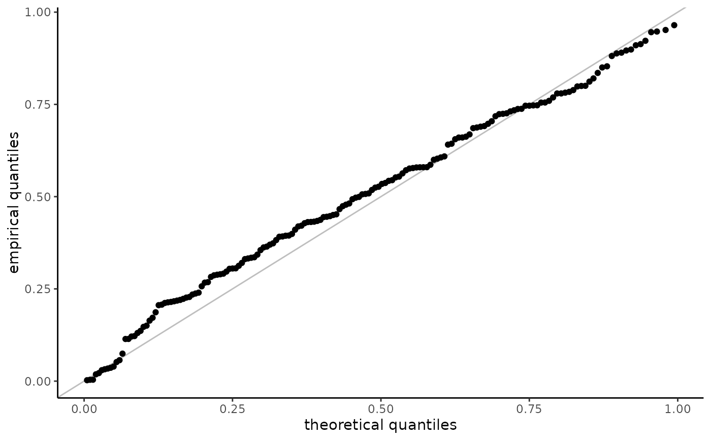
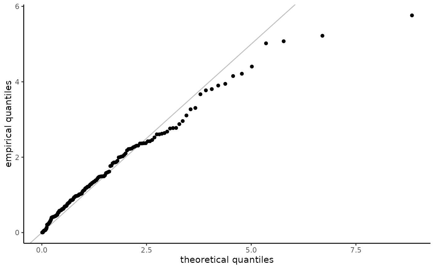
Because of censoring and truncation, the plotting positions must be adjusted accordingly. For right-censored data, the methodology is described in Waller & Turnbull (1992). Only non-censored observations are displayed, which can create distortion.
Arguments
- object
an object of class
elife_parcontaining the fitted parametric model- ...
additional arguments, currently ignored by the function.
- x
a parametric model of class
elife_par- plot.type
string, one of
basefor base R orggplot- which.plot
vector of string indicating the plots, among
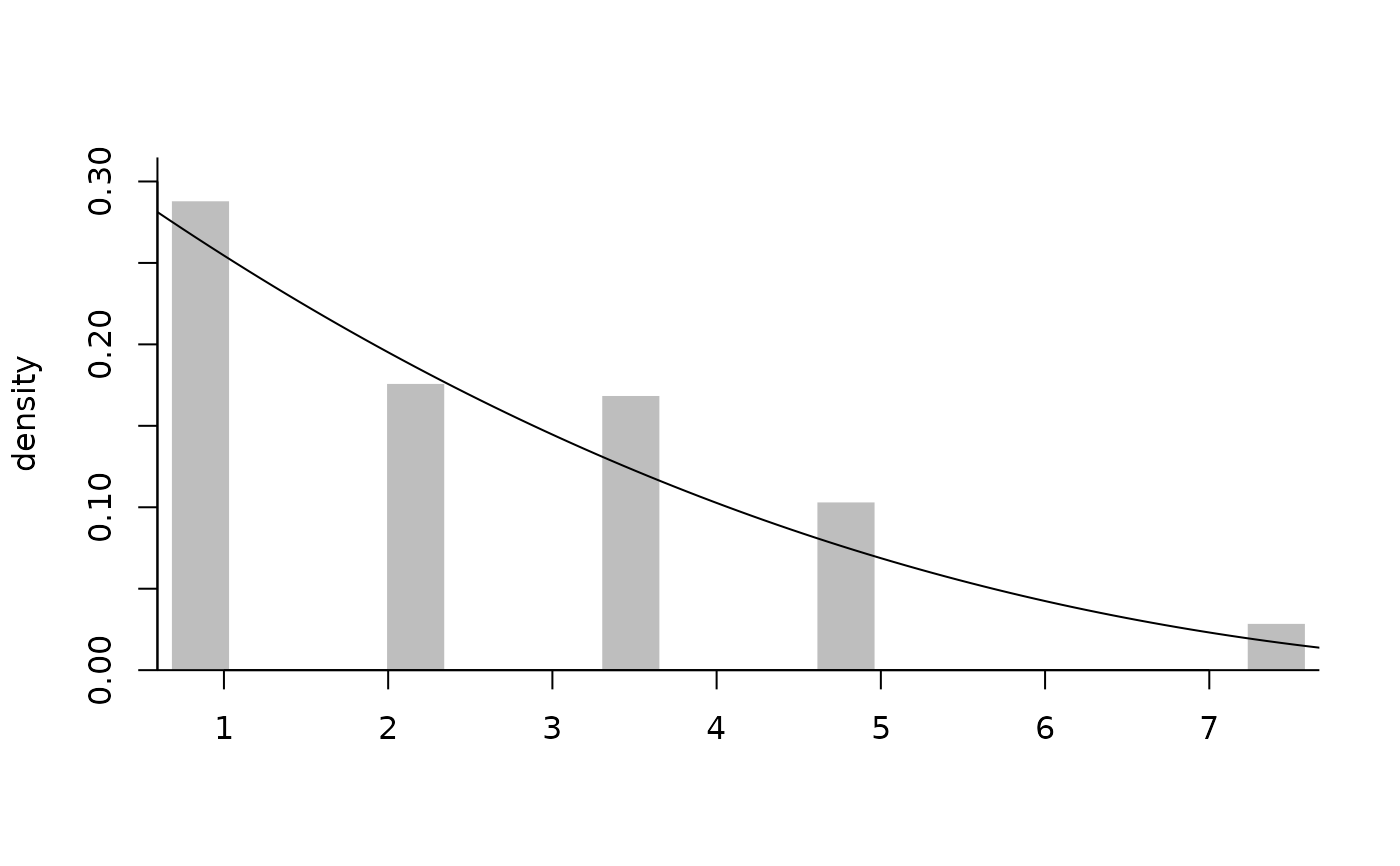
ppfor probability-probability plot,qqfor quantile-quantile plot,erpfor empirically rescaled plot (only for censored data),expfor standard exponential quantile-quantile plot ortmdfor Tukey's mean difference plot, which is a variant of the Q-Q plot in which we map the pair \((x,y)\) is mapped to((x+y)/2,y-x)are detrended,densandcdfreturn the empirical distribution function with the fitted parametric density or distribution function curve superimposed.- confint
logical; if
TRUE, creates uncertainty diagnostic via a parametric bootstrap- plot
logical; if
TRUE, creates a plot whenplot.type="ggplot". Useful for returningggplotobjects without printing the graphs
Value
The function produces graphical goodness-of-fit plots using base R or ggplot objects (returned as an invisible list).
Details
For truncated data, we first estimate the distribution function
nonparametrically, \(F_n\). The uniform plotting positions of the data
$$v_i = [F_n(y_i) - F_n(a_i)]/[F_n(b_i) - F_n(a_i)].$$
For probability-probability plots, the empirical quantiles are transformed
using the same transformation, with \(F_n\) replaced by the postulated or estimated
distribution function \(F_0\).
For quantile-quantile plots, the plotting positions \(v_i\) are mapped back
to the data scale viz. $$F_0^{-1}\{F_0(a_i) + v_i[F_0(b_i) - F_0(a_i)]\}$$
When data are truncated and observations are mapped back to the untruncated scale (with, e.g., exp), the plotting positions need not be in the same order as the order statistics of the data.
Examples
set.seed(1234)
samp <- samp_elife(
 n = 200,
 scale = 2,
 shape = 0.3,
 family = "gomp",
 lower = 0, upper = runif(200, 0, 10),
 type2 = "ltrc")
fitted <- fit_elife(
 time = samp$dat,
 thresh = 0,
 event = ifelse(samp$rcens, 0L, 1L),
 type = "right",
 family = "exp",
 export = TRUE)
plot(fitted, plot.type = "ggplot")


# Left- and right-truncated data
n <- 40L
samp <- samp_elife(
 n = n,
 scale = 2,
 shape = 0.3,
 family = "gp",
 lower = ltrunc <- runif(n),
 upper = rtrunc <- ltrunc + runif(n, 0, 15),
 type2 = "ltrt")
fitted <- fit_elife(
 time = samp,
 thresh = 0,
 ltrunc = ltrunc,
 rtrunc = rtrunc,
 family = "gp",
 export = TRUE)
plot(fitted,  which.plot = c("tmd", "dens"))

