1 Introduction to statistical inference
Statistical modelling requires a good graps of statistical inference: as such, we begin with a review of hypothesis testing and graphical exploratory data analysis.
The purpose of statistical inference is to draw conclusions based on data. Scientific research relies on hypothesis testing: once an hypothesis is formulated, the researcher collects data, performs a test and concludes as to whether there is evidence for the proposed theory.
There are two main data type: experimental data are typically collected in a control environment following a research protocol with a particular experimental design: they serve to answer questions specified ahead of time. This approach is highly desirable to avoid the garden of forking paths (researchers unfortunately tend to refine or change their hypothesis in light of data, which invalidates their findings — preregistration alleviates this somewhat). While experimental data are highly desirable, it is not always possible to collect experimental data: for example, an economist cannot modify interest rates to see how it impacts consumer savings. When data have been collected beforehand without intervention (for other purposes), these are called observational. These will be the ones most frequently encountered.
A stochastic model will comprise two ingredients: a distribution for the random data and a formula linking the parameters or the conditional expectation of a response variable \(Y\) to a set of explanatories \(\mathbf{X}\). A model can serve to either predict new outcomes (predictive modelling) or else to test research hypothesis about the effect of the explanatory variables on the response (explanatory model). These two objectives are of course not mutually exclusive even if we distinguish in practice inference and prediction.
A predictive model gives predictions of \(Y\) for different combinations of explanatory variables or future data. For example, one could try to forecast the enery consumption of a house as a function of weather, the number of inhabitants and its size. Black boxes used in machine learning are often used solely for prediction: these models are not easily interpreted and they often ignore the data structure.
By constrast, explicative models are often simple and interpretable: regression models are often used for inference purpose and we will focus on these. The following examples will be covered in class or as part of the exercices:
- Are consumer ready to spend more when they pay by credit card rather than by cash?
- Is there wage discrimination towards women in a US college?
- University degree: ``is the university experience worth the cost’’?
- What are the criteria impacting health insurance premiums?
- Is the price of gasoline more expansive in the Gaspé peninsula than in the rest of Quebec? A report of the Régie de l’énergie examines the question
- Are driving tests in the UK easier if you live in a rural area? An analysis of The Guardian hints that it is the case.
- Does the risk of transmission of Covid19 increase with distancing? A (bad) meta-analysis says two meters is better than one (or how to draw erroneous conclusions from a bad model).
1.1 Hypothesis testing
An hypothesis test is a binary decision rule used to evaluate the statistical evidence provided by a sample to make a decision regarding the underlying population. The main steps involved are:
- define the model parameters
- formulate the alternative and null hypothesis
- choose and calculate the test statistic
- obtain the null distribution describing the behaviour of the test statistic under \(\mathscr{H}_0\)
- calculate the p-value
- conclude (reject or fail to reject \(\mathscr{H}_0\)) in the context of the problem.
A good analogy for hypothesis tests is a trial for murder on which you are appointed juror.
- The judge lets you choose between two mutually exclusive outcome, guilty or not guilty, based on the evidence presented in court.
- The presumption of innocence applies and evidences are judged under this optic: are evidence remotely plausible if the person was innocent? The burden of the proof lies with the prosecution to avoid as much as possible judicial errors. The null hypothesis \(\mathscr{H}_0\) is not guilty, whereas the alternative \(\mathscr{H}_a\) is guilty. If there is a reasonable doubt, the verdict of the trial will be not guilty.
- The test statistic (and the choice of test) represents the summary of the proof. The more overwhelming the evidence, the higher the chance the accused will be declared guilty. The prosecutor chooses the proof so as to best outline this: the choice of evidence (statistic) ultimately will maximise the evidence, which parallels the power of the test.
- The final step is the verdict. This is a binary decision, guilty or not guilty. For an hypothesis test performed at level \(\alpha\), one would reject (guilty) if the p-value is less than \(\alpha\).
The above description provides some heuristic, but lacks crucial details. Juliana Schulz goes over these in more details in the next section.
1.1.1 Hypothesis
In statistical tests we have two hypotheses: the null hypothesis (\(\mathscr{H}_0\)) and the alternative hypothesis (\(\mathscr{H}_1\)). Usually, the null hypothesis is the ‘status quo’ and the alternative is what we’re really interested in testing. A statistical hypothesis test allows us to decide whether or not our data provides enough evidence to reject \(\mathscr{H}_0\) in favour of \(\mathscr{H}_1\), subject to some pre-specified risk of error. Usually, hypothesis tests involve a parameter, say \(\theta\), which characterizes the underlying distribution at the population level ans whose value is unknown. A two-sided hypothesis test regarding a parameter \(\theta\) has the form \[\begin{align*} \mathscr{H}_0: \theta=\theta_0 \qquad \text{versus} \qquad \mathscr{H}_a:\theta \neq \theta_0. \end{align*}\] We are testing whether or not \(\theta\) is precisely equal to the value \(\theta_0\). The hypotheses are a statistical representation of our research question.
A common example of two-sided test is one for the regression coefficient \(\beta_j\) associated to an explanatory variable \(\mathrm{X}_j\), for which the null and alternative hypothesis are \[\begin{align*} \mathscr{H}_0: \beta_j=\beta_j^0 \qquad \text{versus} \qquad \mathscr{H}_a:\beta_j \neq \beta_j^0, \end{align*}\] where \(\beta_j^0\) is some value that reflects the research question of interest. For example, if \(\beta_j^0=0\), the underlying question is: is covariate \(\mathrm{X}_j\) impacting the response \(Y\) linearly once other variables have been taken into account?
Note that we can impose direction in the hypotheses and consider alternatives of the form \(\mathscr{H}_a: \theta > \theta_0\) or \(\mathscr{H}_a: \theta < \theta_0\).
1.1.2 Test statistic
A test statistic \(T\) is a functional of the data that summarise the information contained in the sample for \(\theta\). The form of the test statistic is chosen such that we know its underlying distribution under \(\mathscr{H}_0\), that is, the potential values taken by \(T\) and their relative probability if \(\mathscr{H}_0\) is true. Indeed, \(Y\) is a random variable and its value change from one sample to the next. This allows us to determine what values of \(T\) are likely if \(\mathscr{H}_0\) is true. Many statistics we will consider are Wald statistic, of the form \[\begin{align*} T = \frac{\widehat{\theta} - \theta_0}{\mathrm{se}(\widehat{\theta})} \end{align*}\] where \(\widehat{\theta}\) is an estimator of \(\theta\), \(\theta_0\) is the postulated value of the parameter and \(\mathrm{se}(\widehat{\theta})\) is an estimator of the standard deviation of the test statistic \(\widehat{\theta}\).
For example, to test whether the mean of a population is zero, we set \[\begin{align*} \mathscr{H}_0: \mu=0, \qquad \mathscr{H}_a:\mu \neq 0, \end{align*}\] and the Wald statistic is \[\begin{align*} T &= \frac{\overline{X}-0}{S_n/\sqrt{n}} \end{align*}\] where \(\overline{X}\) is the sample mean of \(X_1, \ldots, X_n\), \[\begin{align*} \overline{X} &= \frac{1}{n} \sum_{i=1}^n X_i = \frac{X_1+ \cdots + X_n}{n} \end{align*}\] and the standard error (of the mean) \(\overline{X}\) is \(S_n/\sqrt{n}\); the sample variance \(S_n\) is an estimator of the standard deviation \(\sigma\), \[\begin{align*} S^2_n &= \frac{1}{n-1} \sum_{i=1}^n (X_i-\overline{X})^2. \end{align*}\]
Its important to distinguish between procedures/formulas and their numerical values. An estimator is a rule or formula used to calculate an estimate of some parameter or quantity of interest based on observed data. For example, the sample mean \(\bar{X}\) is an estimator of the population mean \(\mu\). Once we have observed data we can actually compute the sample mean, that is, we have an estimate — an actual value. In other words,
- an estimator is the procedure or formula telling us how to use sample data to compute an estimate. Its a random variable since it depends on the sample.
- an estimate is the numerical value obtained once we apply the formula to observed data
1.1.3 Null distribution and p-value
The p-value allows us to decide whether the observed value of the test statistic \(T\) is plausible under \(\mathscr{H}_0\). Specifically, the p-value is the probability that the test statistic is equal or more extreme to the estimate computed from the data, assuming \(\mathscr{H}_0\) is true. Suppose that based on a random sample \(X_1, \ldots, X_n\) we obtain a statistic whose value \(T=t\). For a two-sided test \(\mathscr{H}_0:\theta=\theta_0\) vs. \(\mathscr{H}_a:\theta \neq \theta_0\), the p-value is \(\mathsf{Pr}_0(|T| \geq |t|)\). If the distribution of \(T\) is symmetric around zero, the p-value is \[\begin{align*} p = 2 \times \mathsf{Pr}_0(T \geq |t|). \end{align*}\]
Consider the example of a two-sided test involving the population mean \(\mathscr{H}_0:\mu=0\) against the alternative \(\mathscr{H}_1:\mu \neq 0\). Assuming the random sample comes from a normal (population) \(\mathsf{No}(\mu, \sigma^2)\), it can be shown that if \(\mathscr{H}_0\) is true (that is, if \(\mu=0\)), the test statistic \[\begin{align*} T = \frac{\overline{X}}{S/\sqrt{n}} \end{align*}\] follows a Student-t distribution with \(n-1\) degrees of freedom, denoted \(\mathsf{St}_{n-1}\). This allows us to calculate the p-value (either from a table, or using some statistical software). The Student-t distribution is symmetric about zero, so the p-value is \(P = 2\times\mathsf{Pr}(T_{n-1} > |t|)\), where \(T \sim \mathsf{St}_{n-1}\).
1.1.4 Conclusion
The p-value allows us to make a decision about the null hypothesis. If \(\mathscr{H}_0\) is true, the p-value follows a uniform distribution. Thus, if the p-value is small, this means observing an outcome more extreme than \(T=t\) is unlikely, and so we’re inclined to think that \(\mathscr{H}_0\) is not true. There’s always some underlying risk that we’re making a mistake when we make a decision. In statistic, there are two type of errors:
- type I error: we reject \(\mathscr{H}_0\) when \(\mathscr{H}_0\) is true,
- type II error: we fail to reject \(\mathscr{H}_0\) when \(\mathscr{H}_0\) is false.
These hypothesis are not judged equally: we seek to avoid error of type I (judicial errors, corresponding to condamning an innocent). To prevent this, we fix a the level of the test, \(\alpha\), which captures our tolerance to the risk of commiting a type I error: the higher the level of the test \(\alpha\), the more often we will reject the null hypothesis when the latter is true. The value of \(\alpha \in (0, 1)\) is the probability of rejecting \(\mathscr{H}_0\) when \(\mathscr{H}_0\) is in fact true, \[\begin{align*} \alpha = \mathsf{Pr}_0\left(\text{ reject } \mathscr{H}_0\right). \end{align*}\] The level \(\alpha\) is fixed beforehand, typically \(1\)%, \(5\)% or \(10\)%. Keep in mind that the probability of type I error is \(\alpha\) only if the null model for \(\mathscr{H}_0\) is correct (sic) and correspond to the data generating mechanism.
The focus on type I error is best understood by thinking about medical trial: you need to prove a new cure is better than existing alternatives drugs or placebo, to avoid extra costs or harming patients (think of Didier Raoult and his unsubstantiated claims that hydrochloroquine, an antipaludean drug, should be recommended treatment against Covid19).
| Decision \ true model | \(\mathscr{H}_0\) | \(\mathscr{H}_a\) |
|---|---|---|
| fail to reject \(\mathscr{H}_0\) | \(\checkmark\) | type II error |
| reject \(\mathscr{H}_0\) | type I error | \(\checkmark\) |
To make a decision, we compare our p-value \(P\) with the level of the test \(\alpha\):
- if \(P < \alpha\), we reject \(\mathscr{H}_0\);
- if \(P \geq \alpha\), we fail to reject \(\mathscr{H}_0\).
Do not mix up level of the test (probability fixed beforehand by the researcher) and the p-value. If you do a test at level 5%, the probability of type I error is by definition \(\alpha\) and does not depend on the p-value. The latter is conditional probability of observing a more extreme likelihood given the null distribution \(\mathscr{H}_0\) is true.
1.1.5 Power
There are two sides to an hypothesis test: either we want to show it is not unreasonable to assume the null hypothesis, or else we want to show beyond reasonable doubt that a difference or effect is significative: for example, one could wish to demonstrate that a new website design (alternative hypothesis) leads to a significant increase in sales relative to the status quo. Our ability to detect these improvements and make discoveries depends on the power of the test: the larger the power, the greater our ability to reject \(\mathscr{H}_0\) when the latter is false.
Failing to reject \(\mathscr{H}_0\) when \(\mathscr{H}_a\) is true corresponds to the definition of type II error, the probability of which is \(1-\gamma\), say. The power of a test is the probability of rejecting \(\mathscr{H}_0\) when \(\mathscr{H}_0\) is false, i.e., \[\begin{align*} \gamma = \mathsf{Pr}_a(\text{reject} \mathscr{H}_0) \end{align*}\] Depending on the alternative models, it is more or less easy to detect that the null hypothesis is false and reject in favor of an alternative.
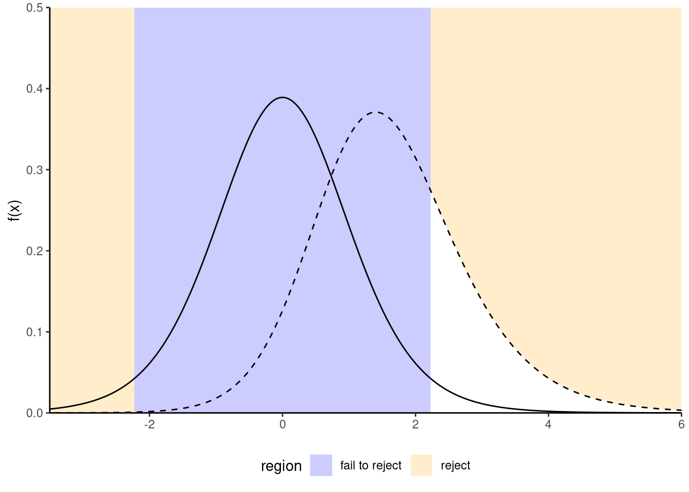
Figure 1.1: Comparison between null distribution (full curve) and a specific alternative for a t-test (dashed line). The power corresponds to the area under the curve of the density of the alternative distribution which is in the rejection area (in white).
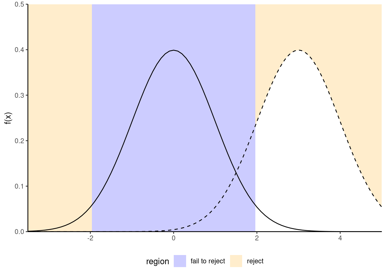
Figure 1.2: Increase in power due to an increase in the mean difference between the null and alternative hypothesis. Power is the area in the rejection region (in white) under the alternative distribution (dashed): the latter is more shifted to the right relative to the null distribution (full line).
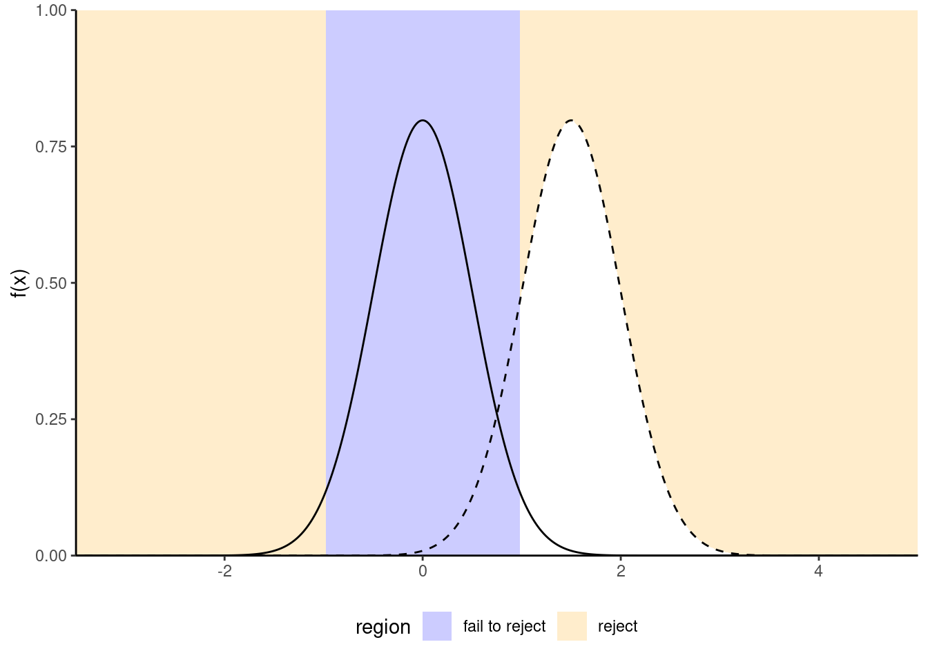
Figure 1.3: Increase of power due to an increase in the sample size or a decrease of standard deviation of the population: the null distribution (full line) is more concentrated. Power is given by the area (white) under the curve of the alternative distribution (dashed). In general, the null distribution changes with the sample size.
We want a test to have high power, i.e., that \(\gamma\) be as close to 1 as possible. Minimally, the power of the test should be \(\alpha\) because we reject the null hypothesis \(\alpha\) fraction of the time even when \(\mathscr{H}_0\) is true. Power depends on many criteria, notably
- the effect size: the bigger the difference between the postulated value for \(\theta_0\) under \(\mathscr{H}_0\) and the observed behavior, the easier it is to detect it. (Figure 1.3);
- variability: the less noisy your data, the easier it is to detect differences between the curves (big differences are easier to spot, as Figure 1.2 shows);
- the sample size: the more observation, the higher our ability to detect significative differences because the standard error decreases with sample size \(n\) at a rate (typically) of \(n^{-1/2}\). The null distribution also becomes more concentrated as the sample size increase.
- the choice of test statistic: for example, rank-based statistics discard information about the actual values and care only about relative ranking. Resulting tests are less powerful, but are typically more robust to model misspecification and outliers. The statistics we will choose are standard and amongst the most powerful: as such, we won’t dwell on this factor.
To calculate the power of a test, we need to single out a specific alternative hypothesis. In very special case, analytic derivations are possible: for example, the one-sample t-test statistic \(T=\sqrt{n}(\overline{X}_n-\mu_0)/S_n \sim \mathcal{T}_{n-1}\) for a normal sample follows a noncentral Student-\(t\) distribution with noncentrality parameter \(\Delta\) if the expectation of the population is \(\Delta + \mu_0\). In general, such closed-form expressions are not easily obtained and we compute instead the power of a test through Monte Carlo methods. For a given alternative, we simulate repeatedly samples from the model, compute the test statistic on these new samples and the associated p-values based on the postulated null hypothesis. We can then calculate the proportion of tests that lead to a rejection of the null hypothesis at level \(\alpha\), namely the percentage of p-values smaller than \(\alpha\).
1.1.6 Confidence interval
A confidence interval is an alternative way to present the conclusions of an hypothesis test performed at significance level \(\alpha\). It is often combined with a point estimator \(\hat{\theta}\) to give an indication of the variability of the estimation procedure. Wald-based \((1-\alpha)\) confidence intervals for a parameter \(\theta\) are of the form \[\begin{align*} \widehat{\theta} \pm \mathfrak{q}_{\alpha/2} \; \mathrm{se}(\widehat{\theta}) \end{align*}\] where \(\mathfrak{q}_{\alpha/2}\) is the \(1-\alpha/2\) quantile of the null distribution of the Wald statistic \[\begin{align*} T =\frac{\widehat{\theta}-\theta}{\mathrm{se}(\widehat{\theta})}, \end{align*}\] and where \(\theta\) represents the postulated value for the fixed, but unknown value of the parameter. The bounds of the confidence intervals are random variables, since both \(\widehat{\theta}\) and \(\mathrm{se}(\widehat{\theta})\) are random variables: their values depend on the sample, and will vary from one sample to another.
For example, for a random sample \(X_1, \ldots, X_n\) from a normal distribution \(\mathsf{No}(\mu, \sigma)\), the (\(1-\alpha\)) confidence interval for the population mean \(\mu\) is \[\begin{align*} \overline{X} \pm t_{n-1, \alpha/2} \frac{S}{\sqrt{n}} \end{align*}\] where \(t_{n-1,\alpha/2}\) is the \(1-\alpha/2\) quantile of a Student-\(t\) distribution with \(n-1\) degrees of freedom.
Before the interval is calculated, there is a \(1-\alpha\) probability that \(\theta\) is contained in the random interval \((\widehat{\theta} - \mathfrak{q}_{\alpha/2} \; \mathrm{se}(\widehat{\theta}), \widehat{\theta} + \mathfrak{q}_{\alpha/2} \; \mathrm{se}(\widehat{\theta}))\), where \(\widehat{\theta}\) denotes the estimator. Once we obtain a sample and calculate the confidence interval, there is no more notion of probability: the true value of the parameter \(\theta\) is either in the confidence interval or not. We can interpret confidence interval’s as follows: if we were to repeat the experiment multiple times, and calculate a \(1-\alpha\) confidence interval each time, then roughly \(1-\alpha\) of the calculated confidence intervals would contain the true value of \(\theta\) in repeated samples (in the same way, if you flip a coin, there is roughly a 50-50 chance of getting heads or tails, but any outcome will be either). Our confidence is in the procedure we use to calculate confidence intervals and not in the actual values we obtain from a sample.
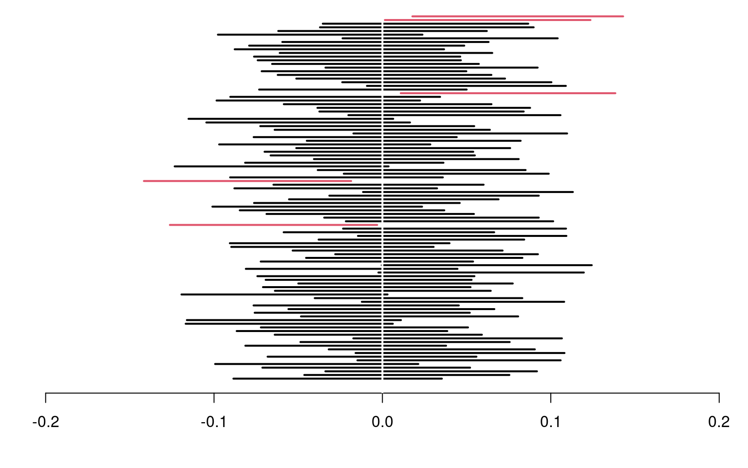
Figure 1.4: 95% confidence intervals for the mean of a standard normal population \(\mathsf{No}(0,1)\), with 100 random samples. On average, 5% of these intervals fail to include the true mean value of zero (in red).
If we are only interested in the binary decision rule reject/fail to reject \(\mathscr{H}_0\), the confidence interval is equivalent to a p-value since it leads to the same conclusion. Whereas the \(1-\alpha\) confidence interval gives the set of all values for which the test statistic doesn’t provide enough evidence to reject \(\mathscr{H}_0\) at level \(\alpha\), the p-value gives the probability under the null of obtaning a result more extreme than the postulated value and so is more precise for this particular value. If the p-value is smaller than \(\alpha\), our null value \(\theta\) will be outside of the confidence interval and vice-versa.
Example 1.1 (Online purchases of millenials) Suppose a researcher studies the evolution of online sales in Canada. She postulates that generation Y members make more online purchase than older generations. A survey is sent to a simple random sample of \(n=500\) individuals from the population with 160 members of generation Y and 340 older people. The response ariable is the total amount of online goods purchased in the previous month (in dollars).
In this example, we consider the difference between the average amount spent by Y members and those of previous generations: the mean difference in the samples is -16.49 dollars and thus millenials spend more. However, this in itself is not enough to conclude that the different is significative, nor can we say it is meaningful. The amount spent online varies from one individual to the next (and plausibly from month to month), and so different random samples would yield different mean differences.
The first step of our analysis is defining the parameters corresponding to quantities of interest and formulating the null and alternative hypothesis as a function of these parameters. We will consider a test for the difference in mean of the two populations, say \(\mu_1\) for the expected amount spent by generation Y and \(\mu_2\) for older generations, with respective standard errors \(\sigma_1\) and \(\sigma_2\). We next write down our hypothesis: the researcher is interested in whether millenials spend more, so this is the alternative hypothesis, \(\mathscr{H}_a: \mu_1 > \mu_2\). The null consists of all other values \(\mathscr{H}_0: \mu_1 \leq \mu_2\), but only \(\mu_1=\mu_2\) matters for the purpose of testing (why?)
The second step is the choice of test statistic. We consider the Welch (1947) statistic for a difference in mean between two samples, \[\begin{align*} T = \frac{\overline{X}_1 - \overline{X}_2}{\left(\frac{S_1^2}{n_1}+\frac{S_2^2}{n_2} \right)^{1/2}}, \end{align*}\] where \(\overline{X}_i\) is the sample mean, \(S_i^2\) is the unbiased variance estimator and \(n_i\) is the sample size for group \(i\) (\(i=1, 2\)). If the mean difference between the two samples is zero, then \(\overline{X}_1-\overline{X}_2\) has mean zero and the difference has variance \(\sigma^2_1/n_1+\sigma^2_2/n_2\). For our sample, the value of statistic is \(T=-2.76\) Since the value changes from one sample to the next, we need to determine if this value is compatible with the null hypothesis by comparing it to the null distribution of \(T\) (when \(\mathscr{H}_0\) is true and \(\mu_1-\mu_2=0\)). We perform the test at level \(\alpha=0.05\).
The third step consists in obtaining a benchmark to determine if our result is extreme or unusual. To make comparisons easier, we standardize the statistic so its has mean zero and variance one under the null hypothesis \(\mu_1=\mu_2\), so as to obtain a dimensionless measure whose behaviour we know for large sample. The (mathematical) derivation of the null distribution is beyond the scope of this course, and will be given in all cases. Asymptotically, \(T\) follows a standard normal distribtion \(\mathsf{No}(0, 1)\), but there exists a better finite-sample approximation when \(n_1\) or \(n_2\) is small; we use Satterthwaite (1946) and a Student-\(t\) distribution as null distribution.
It only remains to compute the p-value. If the null distribution is well-specified and \(\mathscr{H}_0\) is true, then the random variable \(P\) is uniform on \([0, 1]\); we thus expect to obtain under the null something larger than 0.95 only 5% of the time for our one-sided alternative since we consider under \(\mathscr{H}_0\) the event \(\mathsf{Pr}(T > t)\). The \(p\)-value is \(1\) and, at level 5%, we reject the null hypothesis to conclude that millenials spend significantly than previous generation for monthly online purchases, with an estimated average difference of -16.49.
Example 1.2 (Price of Spanish high speed train tickets) The Spanish national railway company, Renfe, manages regional and high speed train tickets all over Spain and The Gurus harvested the price of tickets sold by Renfe. We are interested in trips between Madrid and Barcelona and, for now, ask the question: are tickets more expensive one way or another? To answer this, we consider a sample of 10000 tickets, but restrict attention to AVE tickets sold at Promo rate. Our test statistic will again be the mean difference between the price (in euros) for a train ticket for Madrid–Barcelona (\(\mu_1\)) and the price for Barcelona–Madrid (\(\mu_2\)), i.e., \(\mu_1-\mu_2\). The null hypothesis is that there are no difference in price, so \(\mathscr{H}_0: \mu_1-\mu_2=0\).
| price | type | class | fare | dest | duration | wday |
|---|---|---|---|---|---|---|
| 143.4 | AVE | Preferente | Promo | Barcelona-Madrid | 190 | 6 |
| 181.5 | AVE | Preferente | Flexible | Barcelona-Madrid | 190 | 2 |
| 86.8 | AVE | Preferente | Promo | Barcelona-Madrid | 165 | 7 |
| 86.8 | AVE | Preferente | Promo | Barcelona-Madrid | 190 | 7 |
| 69.0 | AVE-TGV | Preferente | Promo | Barcelona-Madrid | 175 | 4 |
We again use Welch test statistic for two samples by filtering the data to keep only Promo fare tickets: the sample mean of the price of Barcelona-Madrid tickets is 82.11 euros, that of Madrid-Barcelona tickets is 82.56 euros and the Welch statistic is worth -1.33. If we use a normal approximation, the p-value is 0.18.
Rather than use the asymptotic distribution, whose validity stems from the central limit theorem, we could consider another approximation under the less restrictive assumption that the data are exchangeable: under the null hypothesis, there is no difference between the two destinations and so the label for destination (a binary indicator) is arbitrary. The reasoning underlying permutation tests is as follows: to create a benchmark, we will consider observations with the same number in each group, but permuting the labels. We then compute the test statistic on each of these datasets. If there are only a handful in each group (fewer than 10), we could list all possible permutations of the data, but otherwise we can repeat this procedure many times, say 9999, to get a good approximation. This gives an approximate distribution from which we can extract the p-value by computing the rank of our statistic relative to the others.
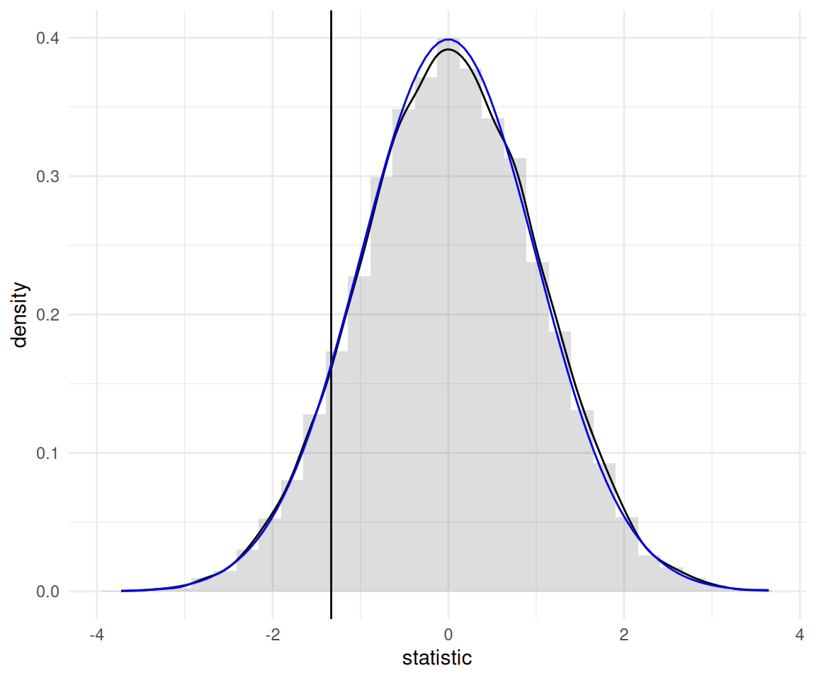
Figure 1.5: Permutation-based approximation to the null distribution of Welch two-sample t-test statistic (histogram and black curve) with standard normal approximation (blue curve) for the price of AVE tickets at promotional rate between Madrid and Barcelona. The value of the test statistic calculated using the original sample is represented by a vertical line.
The so-called bootstrap approximation to the p-value of the permutation test, \(0.186\), is the proportion of statistics that are more extreme than the one based on the original sample. It is nearly identical to that obtained from the Satterthwaite approximation, \(0.182\) (the Student-\(t\) distribution is numerically equivalent to a standard normal with that many degrees of freedom), as shown in Figure 1.5. Even if our sample is very large (\(n=8059\) observations), the difference is not statistically significative. With a bigger sample (the database has more than 2 million tickets), we could estimate more precisely the average difference, up to 1/100 of an euro: the price difference would eventually become statistically significative, but this says nothing about practical difference: \(0.28\) euros relative to an Promo ticket priced on average \(82.56\) euros is a negligible amount.
1.2 Exploratory Data Analysis
Before fitting a model, it is advisable to understand the structure of the data to avoid interpretation errors. Basic knowledge of graphs is required and we will spend some time addressing this. Further references include
- Chapter 3, R for Data Science by Garrett Grolemund and Hadley Wickham
- Section 1.6 of OpenIntro Introductory Statistics with Randomization and Simulation
- Fundamentals of Data Visualization by Claus O. Wilke
- Chapter 1 of Data Visualization: A practical introduction by Kieran Healy
If exploratory data analysis is often neglected in statistics (perhaps because it has little to no mathematical foundations), it is crucial. More than a rigorous approach, it is an art: Grolemund and Wickham talk of “state of mind”. The purpose of graphical exploratory data analysis is the extraction of useful information, often through a series of preliminary questions that are refined as the analysis progresses. Of particular interest and the relations and interactions between difference variables and the distribution of the variables themselves. The major steps for undertaking an exploratory analysis are:
- Formulate questions about the data
- Look for answers using frequency table, descriptive statistics and graphics.
- Refine the questions in light of the finding
In a report, you should highlight the most import features in a summary so that the reader can grasp your understanding and so that you guide him or her in the interpretation of the data.
1.2.1 Polish your work
Pay as much attention to figures and tables than to the main text. These should always include a legend that describes and summarize the findings in the graph (so that the latter is standalone), name of variables (including units) on the axes, but also proper formatting so that the labels and numbers are readable (good printing quality, not too small). One picture is worth 1000 words, but make sure the graph tells a coherent story and that it is mentioned in the main text. Also ensure that only the necessary information is displayed: superfluous information (spurious digits, useless summary statistics) should not be presented.
1.2.2 Variable type
- a variable represents a characteristic of the population, for example the sex of an individual, the price of an item, etc.
- an observation is a set of measures (variables) collected under identical conditions for an individual or at a given time.
The choice of statistical model and test depends on the underlying type of the data collected. There are many choices: quantitative (discrete or continuous) if the variables are numeric, or qualitative (binary, nominal, ordinal) if they can be described using an adjective; I prefer the term categorical, which is more evocative.
Most of the models we will deal with are so-called regression models, in which the mean of a quantitative variable is a function of other variables, termed explanatories. There are two types of numerical variables
- a discrete variable takes a countable number of values, prime examples being binary variables or count variables.
- a continuous variable can take (in theory) an infinite possible number of values, even when measurements are rounded or measured with a limited precision (time, width, mass). In many case, we could also consider discrete variables as continuous if they take enough values (e.g., money).
Categorical variables take only a finite of values. They are regrouped in two groups, nominal if there is no ordering between levels (sex, color, country of origin) or ordinal if they are ordered (Likert scale, salary scale) and this ordering should be reflected in graphs or tables. We will bundle every categorical variable using arbitrary encoding for the levels: for modelling, these variables taking \(K\) possible values (or levels) must be transformed into a set of \(K-1\) binary 0/1 variables, the omitted level corresponding to a baseline. Failing to declare categorical variables in your favorite software is a common mistake, especially when these are saved in the database using integers rather than strings.
1.2.3 Graphs
The main type of graph for representing categorical variables is bar plot (and modifications thereof). In a bar plot, the frequency of each category is represented in the \(y\)-axis as a function of the (ordered) levels on the \(x\)-axis. This representation is superior to the ignominious pie chart, a nuisance that ought to be banned (humans are very bad at comparing areas and a simple rotation changes the perception of the graph)!
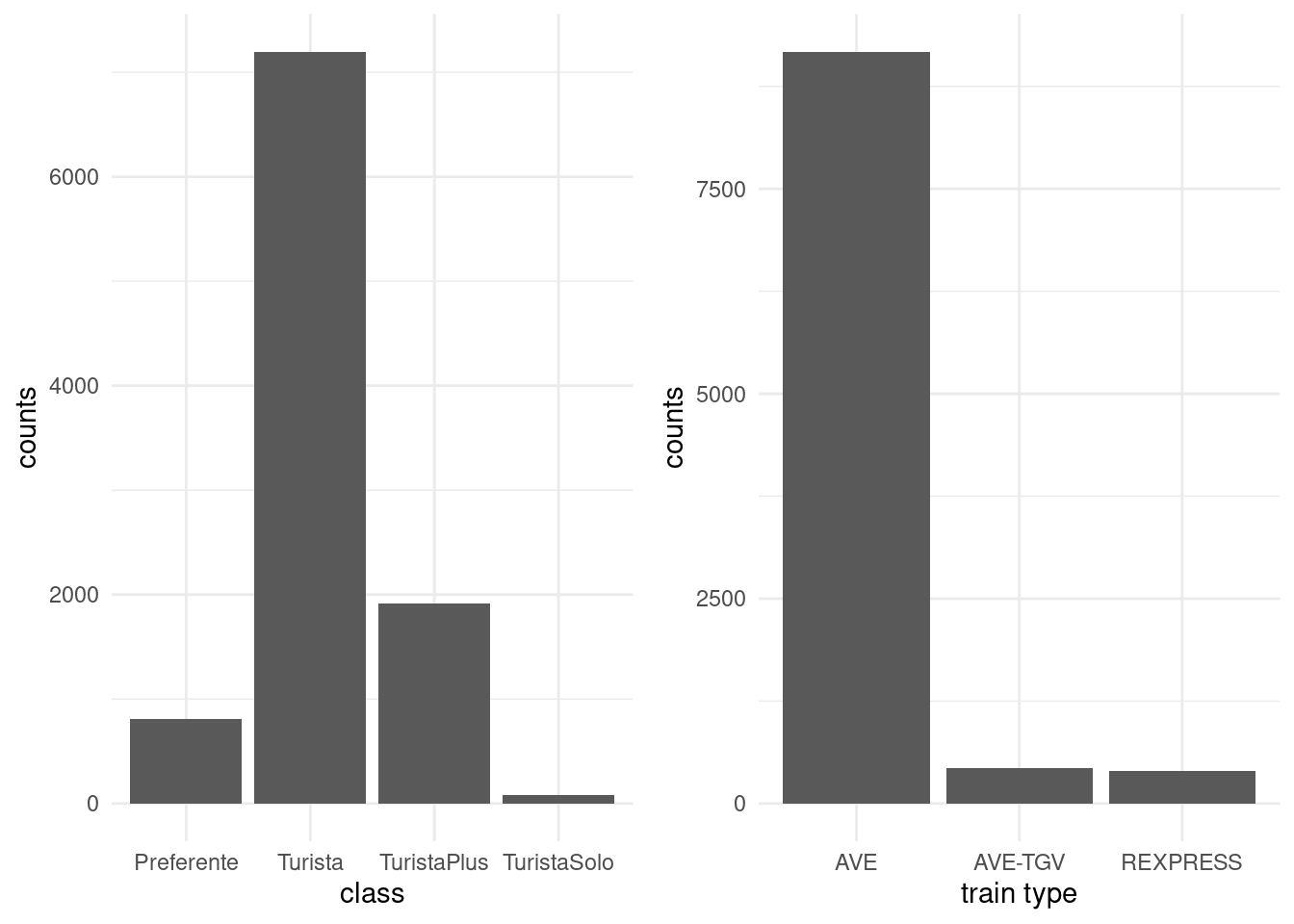
Figure 1.6: Bar plot of ticket class for Renfe tickets data
Continuous variables can take as many distinct values as there are observations, so we cannot simply count the number of occurences by unique values. Instead, we bin them into distinct intervals so as to obtain an histogram. The number of class depends on the number of observations: as a rule of thumb, the number of bins should not exceed \(\sqrt{n}\), where \(n\) is the sample size. We can then obtain the frequency in each class, or else normalize the histogram so that the area under the bands equals one: this yields a discrete approximation of the underlying density function. Varying the number of bins can help us detect patterns (rounding, asymmetry, multimodality).
Since we bin observations together, it is sometimes difficult to see where they fall. Adding rugs below or above the histogram will add observation about the range and values taken, where the heights of the bars in the histogram carry information about the (relative) frequency of the intervals.
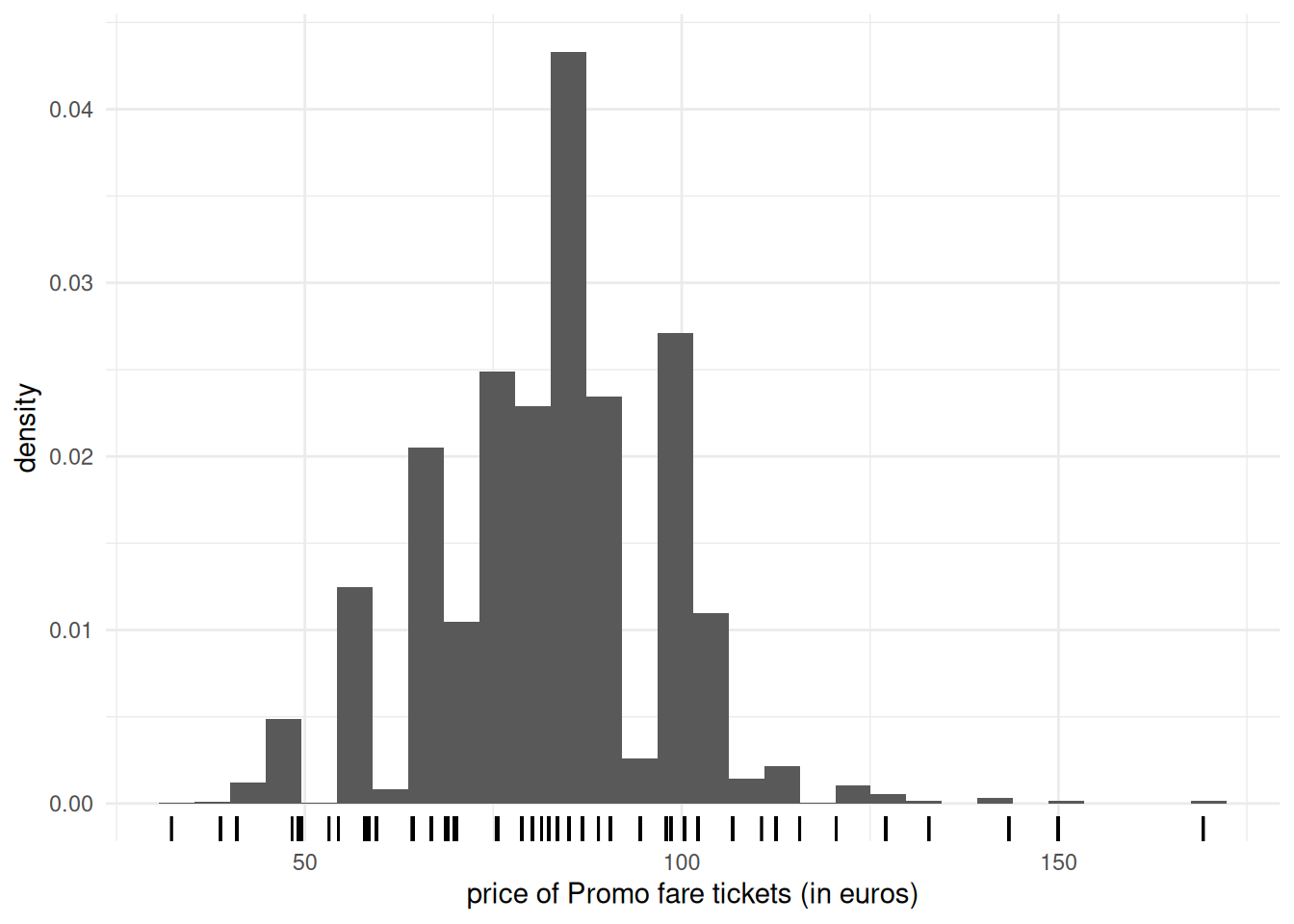
Figure 1.7: Histogram of Promo tickets for Renfe ticket data
If we have a lot of data, it sometimes help to focus only on selected summary statistics. A box-and-whiskers plot (or boxplot) represents five numbers
- The box gives the quartiles \(q_1, q_2, q_3\) of the distribution. The middle bar \(q_2\) is thus the median, so 50% of the observations are smaller or larger than this number.
- The length of the whiskers is up to \(1.5\) times the interquartiles range \(q_3-q_1\) (the whiskers extend until the latest point in the interval, so the largest observation that is smaller than \(q_3+1.5(q_3-q_1)\), etc.)
- Observations beyond the whiskers are represented by dots or circles, sometimes termed outliers. However, beware of this terminology: the larger the sample size, the more values will fall outside the whiskers. This is a drawback of boxplots, which was conceived at a time where the size of data sets was much smaller than what is current standards.
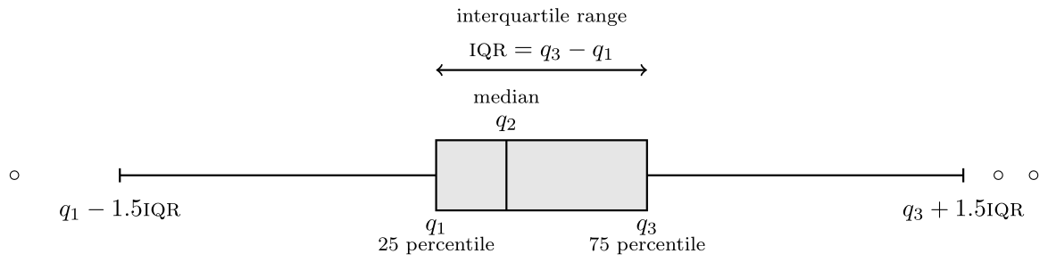
Figure 1.8: Box-and-whiskers plot
We can represent the distribution of a response variable as a function of a categorical variable by drawing a boxplot for each category and laying them side by side. A third variable, categorical, can be added via a color palette, as shown in Figure 1.9.
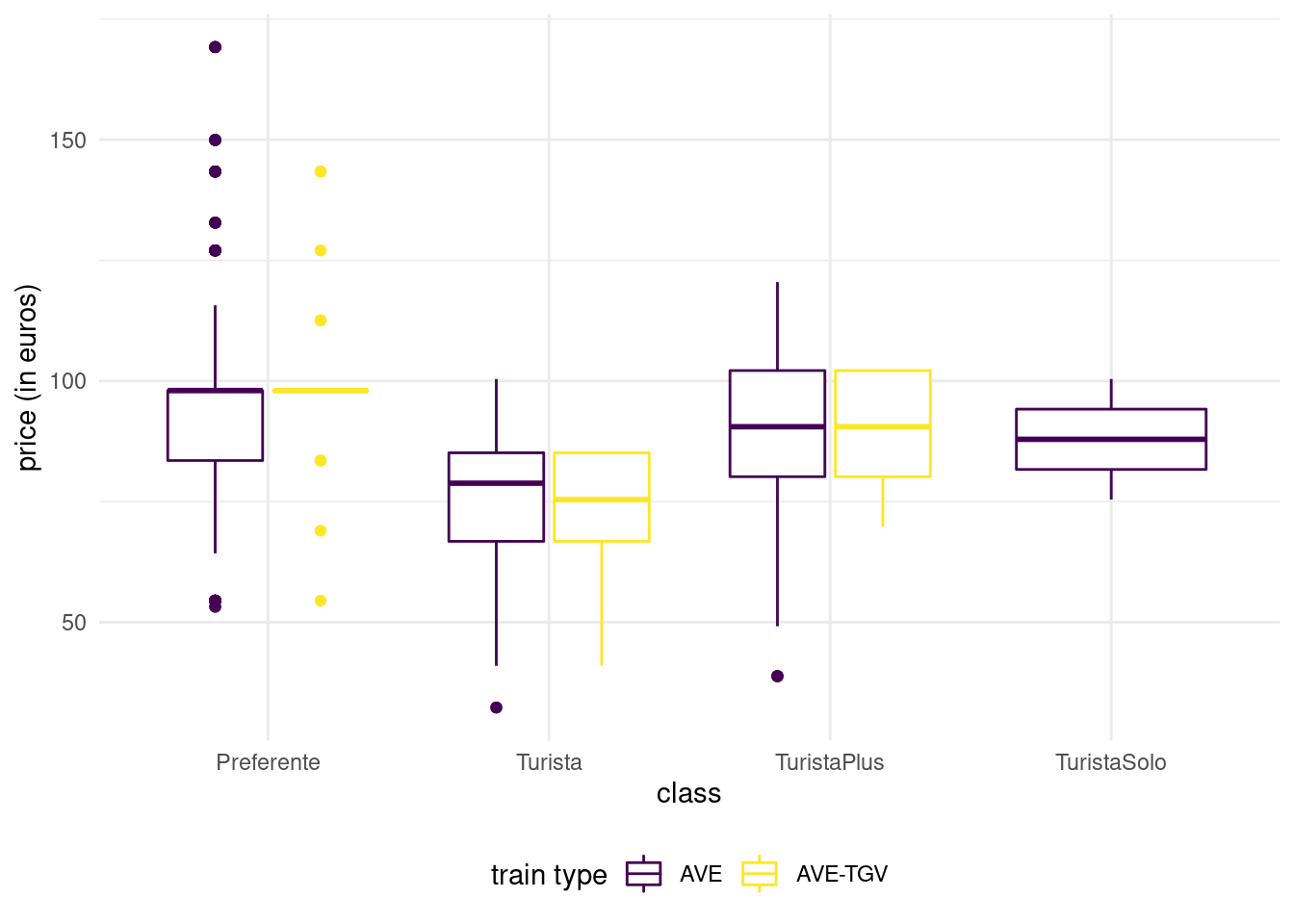
Figure 1.9: Box-and-whiskers plots for Promo fare tickets as a function of class and type for the Renfe tickets data.
Scatterplots are used to represent graphically the co-variation between two continuous variables: each tuple gives the coordinate of the point. If only a handful of large values are visible on the graph, a transformation may be useful: oftentimes, you will encounter graphs where the \(x\)- or \(y\)-axis is on the log-scale when the underlying variable is positive. If the number of data points is too large, it is hard to distinguish points because they are overlaid: adding transparency, or binning using a two-dimensional histogram with the frequency represented using color are potential solutions. The left panel of Figure 1.10 shows the 100 simulated observations, whereas the right-panel shows a larger sample of 10 000 points using hexagonal binning, an analog of the bivariate density.
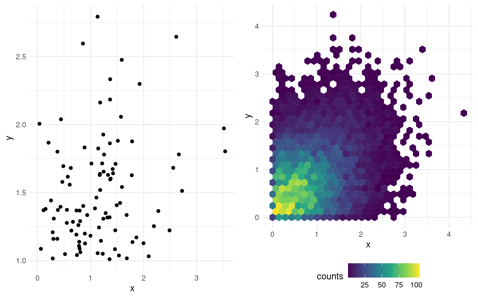
Figure 1.10: Scatterplot (left) and hexagonal heatmap of bidimensional bin counts (right) of simulated data.
1.2.4 Exploratory data analysis
Rather than describe in details the exploratory analysis procedure, we proceed with an example that illustrates the process on the Renfe ticket dataset that was introduced previously.
Example 1.3 (Exploratory data analysis of Renfe tickets) First, read the documentation accompanying the dataset! The data base renfe contains the following variables:
priceprice of the ticket (in euros);destbinary variable indicating the journey, either Barcelona to Madrid (0) or Madrid to Barcelona (1);farecategorical variable indicating the ticket fare, one ofAdultoIda,PromoorFlexible;classcategorical variable giving the ticket class, eitherPreferente,Turista,TuristaPlusorTuristaSolo;typecategorical variable indicating the type of train, either Alta Velocidad Española (AVE), Alta Velocidad Española jointly with TGV (parternship between SNCF and Renfe for trains to/from Toulouse)AVE-TGVor regional trainREXPRESS; only trains labelledAVEorAVE-TGVare high-speed trains.durationlength of train journey (in minutes);wdaycategorical variable (integer) denoting the week day, ranging from Sunday (1) to Saturday (7).
There are no missing values and a quick view of the first row of the data frame (head(renfe)) shows that the data are stored in long format, meaning each line corresponds to a different ticket.
We will begin our exploratory analysis with vague questions, for example
- What are the factors determining the price and travel time?
- Does travel time depend on the type of train?
- What are the distinctive features of train types?
- What are the main differences between fares?
The database is clean and this preliminary preprocessing step has been done already. We could look at variable type and some descriptive statistics.
Except for price and duration, all the other (explanatory) variables are categoricals. We must keep this in mind, especially since wday has integer-valued levels.
| class | n |
|---|---|
| Preferente | 809 |
| Turista | 7197 |
| TuristaPlus | 1916 |
| TuristaSolo | 78 |
| type | n |
|---|---|
| AVE | 9174 |
| AVE-TGV | 429 |
| REXPRESS | 397 |
| fare | n |
|---|---|
| AdultoIda | 397 |
| Flexible | 1544 |
| Promo | 8059 |
By counting the number of train tickets in each category, we notice there are as many REXPRESS tickets as there are tickets sold at AdultoIda fare. Using a contingency table to get the number in respective sub-categories of each of those variables confirms that all tickets in the database for RegioExpress trains are sold with the AdultoIda fare and that there is only a single class, Turista. There are few such tickets, only 397 out of 10 000. This raises a new question: why are such trains so unpopular?
| fare | type | n |
|---|---|---|
| AdultoIda | REXPRESS | 397 |
| Flexible | AVE | 1446 |
| Flexible | AVE-TGV | 98 |
| Promo | AVE | 7728 |
| Promo | AVE-TGV | 331 |
We have only scratched the surface, but one could also notice that there are only 17 duration values on tickets (renfe %>% distinct(duration) or unique(renfe$duration)). This leads us to think the duration on the ticket (in minutes) is the expected travel time. The majority of those travel time (15 out of 17) are smaller than 3h15, but the other two exceed 9h! Looking at Google Maps, Madrid and Barcelona are 615km apart by car, 500km as the crow flies. this means some trains travel at about 200km/h, while others are closer to 70km/h. What are these slower trains? the variable type is the one most likely to encode this feature, and a quick look shows that the RegioExpress trains fall in the slow category (mystery solved!)
| type | dest | average duration | std. dev | average price |
|---|---|---|---|---|
| REXPRESS | Barcelona-Madrid | 544 | 0 | 43.2 |
| REXPRESS | Madrid-Barcelona | 562 | 0 | 43.2 |
The regular trains running between two cities take more than 9h, but one way (Madrid to Barcelona) is 18 minutes slower than in the other direction. More striking, we see that the price of the RegioExpress tickets is fixed: 43.25 euros regardless of direction. This is the most important finding so far, because these are not a sample for price: there is no variability! Graphics could have lead to the discovery (the boxplot of price as a function of train type would collapse to a single value).
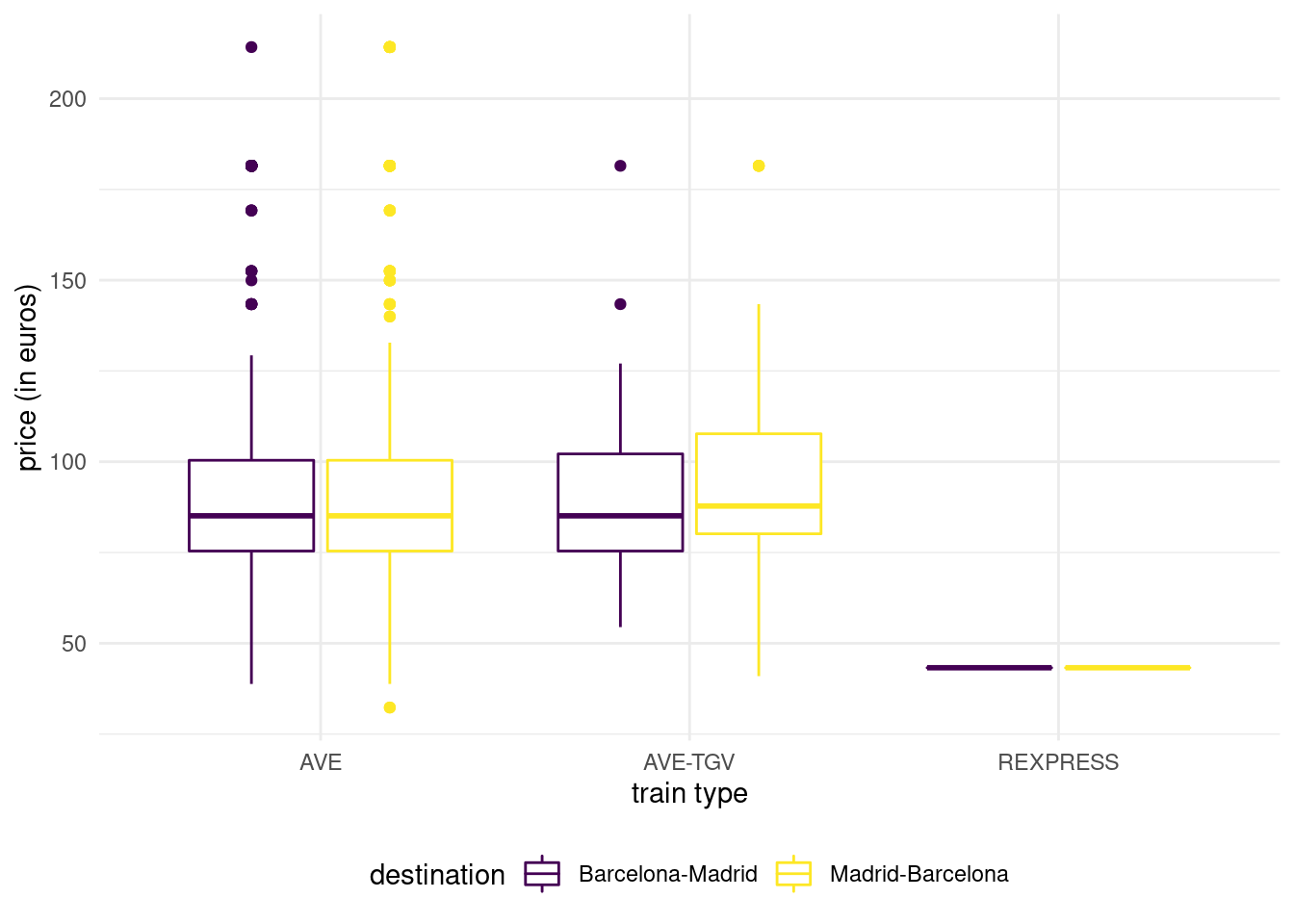
Figure 1.11: Boxplot of ticket price as a function of destination and train type.
We could have suspected that trains labeled AVE are faster: after all, it is the acronym of Alta Velocidad Española, literally Spanish high speed. What is the distinction between the two high speed train types. According to the SNCF website, AVE-TGV trains are partnership between Renfe and SNCF that operate between France and Spain.
| type | dest | average duration | std. dev | average price |
|---|---|---|---|---|
| AVE | Barcelona-Madrid | 171 | 19.8 | 87.4 |
| AVE | Madrid-Barcelona | 170 | 20.8 | 88.2 |
| AVE-TGV | Barcelona-Madrid | 175 | 16.8 | 87.0 |
| AVE-TGV | Madrid-Barcelona | 179 | 20.2 | 90.6 |
The price of high speed trains are on average more than twice as expensive as regular trains. There is strong evidence of heterogeneity (standard deviation of 20 euros), which should raise scrutiny and suggests that high speed train tickets are dynamically priced. There is a single duration time for AVE-TGV tickets. We do not see meaningful differences in price depending on the type or the direction, but fares of ticket class availability may differ depending on whether the train is run in partnership with SNCF.
We have not looked at ticket fare and class, except for RegioExpress trains. Figure 1.13 shows large disparity in the variance of price according to fare: Promo fare takes many more distinct values than AdultoIda (duh) and Flexible fares. First class tickets (Preferente) are more expensive, but there are fewer observations falling in this group. Turista class is the least expensive for high-speed trains and the most popular. TuristaPlus offer an alternative to the latter with more comfort, whereas TuristaSolo gives access to individual seats.
Fare-wise Promo and PromoPlus give access to rebates that can go up to 70% and 65%, respectively. Promo tickets cannot be cancelled or exchanged, while both are possible with PromoPlus by paying a penalty amounting to 30-20% of the ticket price. Flexible fare ticket a sold at the same price as regular high-speed train tickets, but offer additional benefits (and no rebates!)
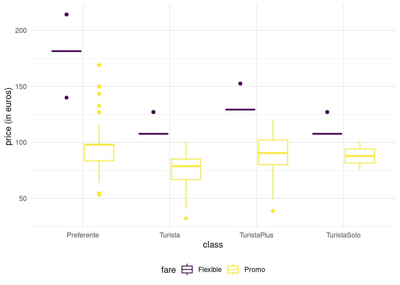
Figure 1.12: Boxplot of ticket price as a function of fare and class for high-speed Renfe trains.
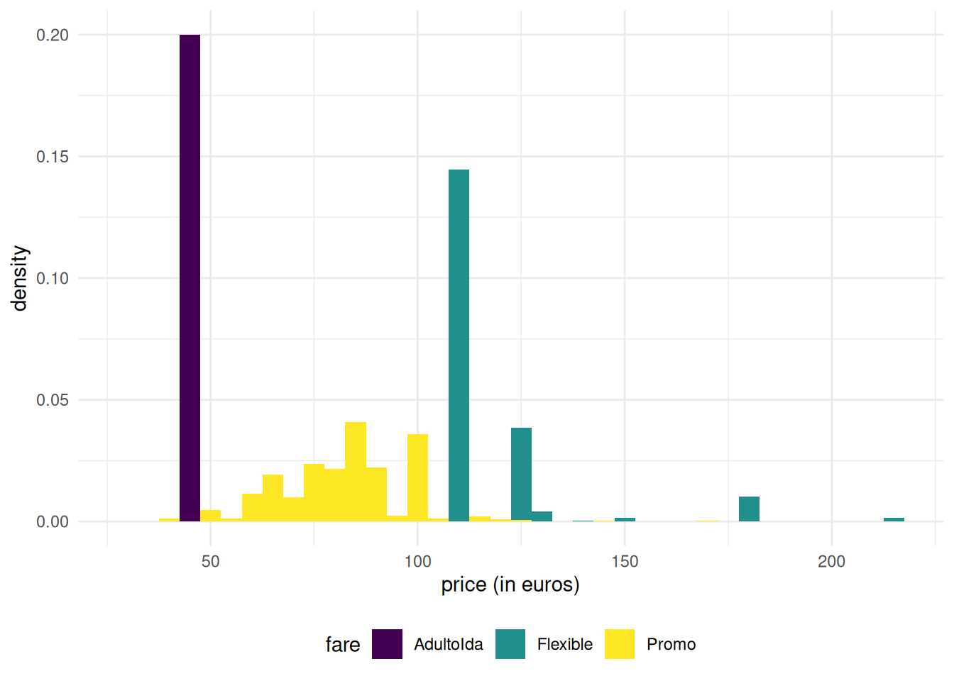
Figure 1.13: Histograms of ticket price as a function of fare for Renfe trains.
| price | class | n |
|---|---|---|
| 108 | Turista | 1050 |
| 108 | TuristaSolo | 67 |
| 127 | Turista | 285 |
| 127 | TuristaSolo | 9 |
| 129 | TuristaPlus | 31 |
| 140 | Preferente | 2 |
| 152 | TuristaPlus | 10 |
| 182 | Preferente | 78 |
| 214 | Preferente | 12 |
Note how Flexible tickets prices are spread: the boxplot is crushed and the interquartile range seems zero, even if some of the values are larger: this is indicative either constant price or of (too few) tickets in the category. We can find out which of these two possibities is most likely by counting the number of Flexible fare tickets for the different types.
Neither duration, nor type or destination explains why some Flexible tickets are more or less expensive than the average. Promo tickets, on the other hand, are cheaper on average and Preferente more expensive.
We can summarize our findings:
- more than 91% of trains are high-speed trains.
- travel time depends on the type of train: high-speed train take at most 3h20.
- duration records expected travel time: there are only 17 unique values, 13 of which are for AVE trains.
- the price of RegioExpress train ticket is fixed (43.25€); all such tickets are sold with AdultoIda fare and there only one class (Turista). 57% of these trains go from Barcelona to Madrid and travel time is 9h22 from Barcelona to Madrid, 9h04 in the other direction.
Turistais the cheapest and most popular class.Preferenteclass tickets are more expensive and are less often sold.TuristaPlusoffers more comfort andTuristaSololet you get individual seats.- according to the Renfe website,
Flexiblefare tickets “come with additional offers and passengers can exchange or cancel their tickets if they miss their train”; as a counterpart, these tickets are more expensive and most tickets have a fixed fare (a handful are cheaper or more expensive, but this price difference is unexplained). - the distribution of
Promofare high-speed trains ticket prices are more or less symmetric, butFlexibletickets seem left-truncated (the minimum price for these tickets in the sample is 107.7€). - it appears that tickets sold by Renfe (
Promofare) are dynamically priced: the latter can be up to 70% cheaper than regular high-speed train tickets when purchased through the official agency or Renfe’s website. These tickets cannot be refunded or exchanged. - there is no indication that prices depend on the direction of travel.